Typography in the Netherlands
My husband and I visited the Netherlands this summer, and I couldn’t help but record some of the beautiful, funny, and well-crafted typography I saw. Hope you enjoy this multi-century, multi-city survey of type from the low countries. Click images to get a closer view or view this as a slideshow.
-

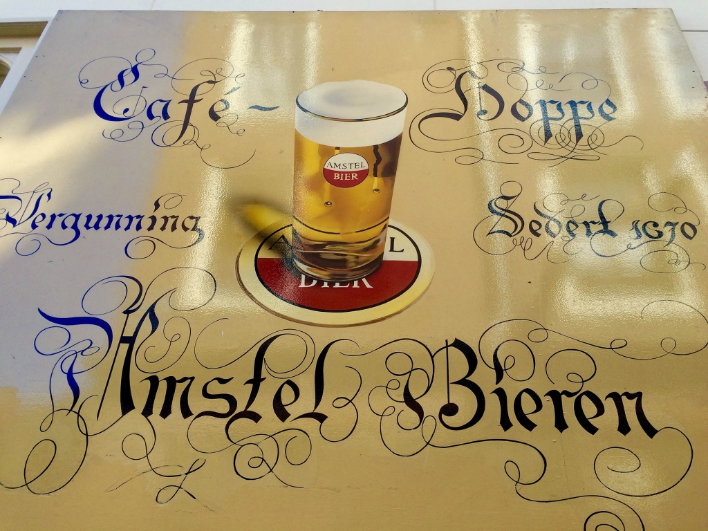
- Cafe Hoppe’s shining blackletter type sign with flourishes galore; the depiction of the beer is also quite enticing.
-
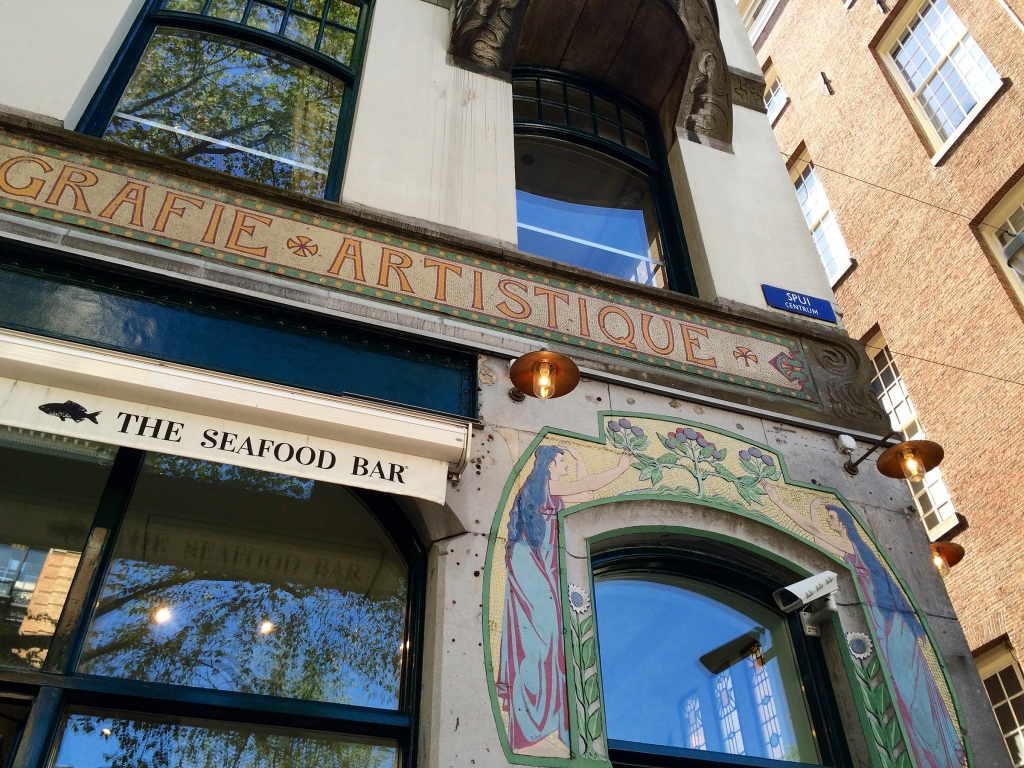
- Beautiful art deco building with type executed in mosaic. By the way, the Seafood Bar here serves a superb Fruits de Mer.
-

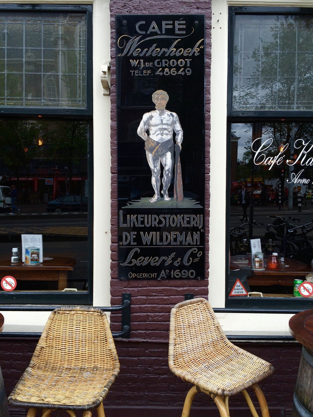
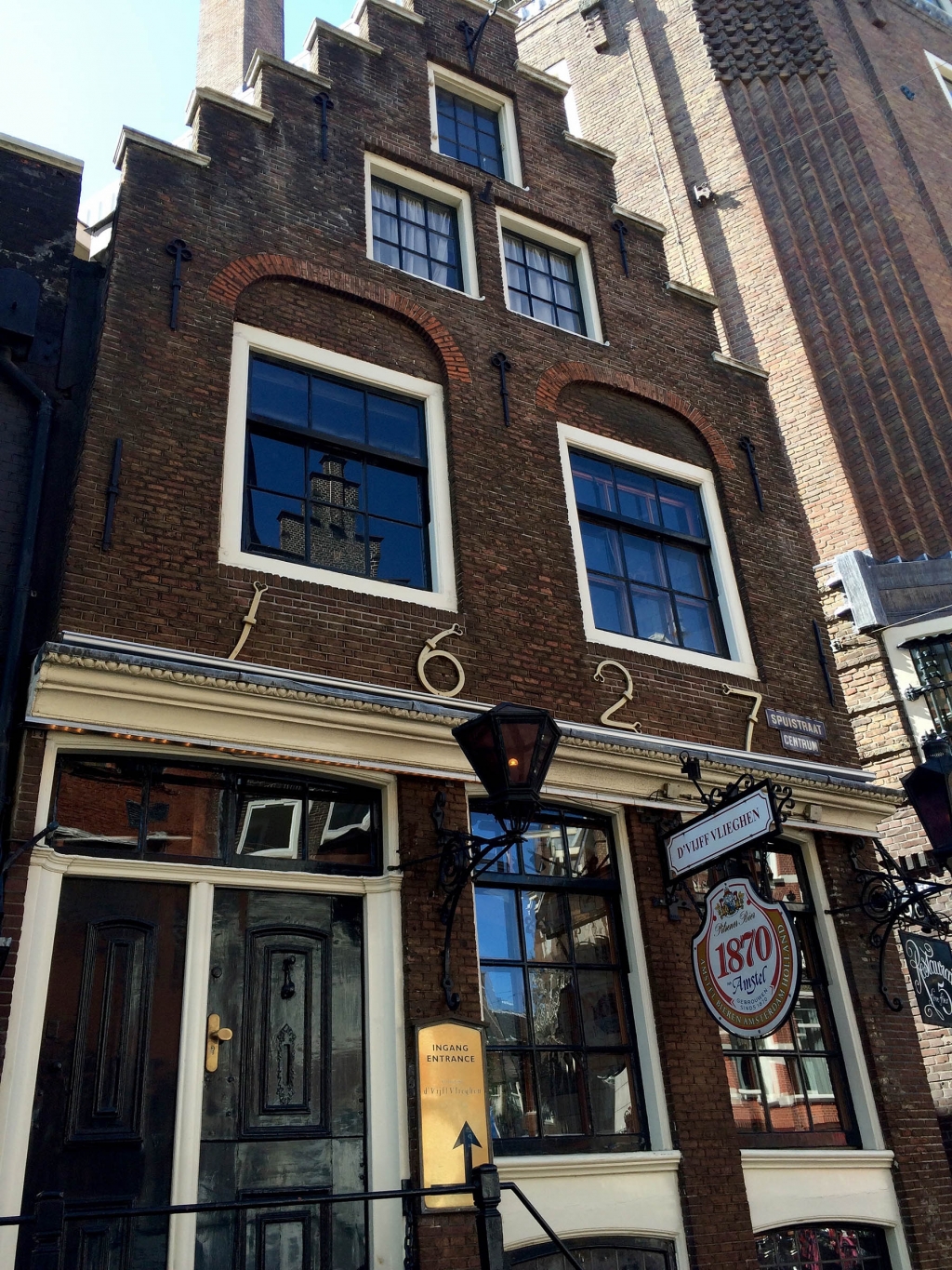
- Is this a gorgeous etched stone sign or what? I wonder when it was made (the type certainly looks more modern than what might have been done back in 1690, the founding date on the sign).
-
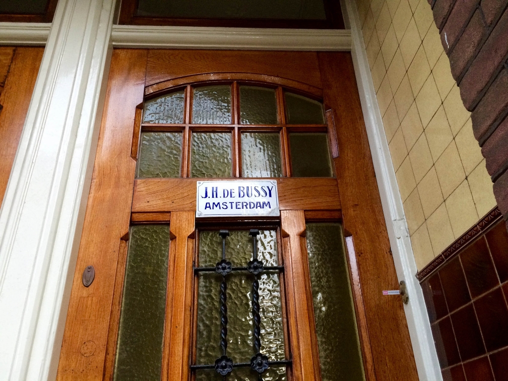
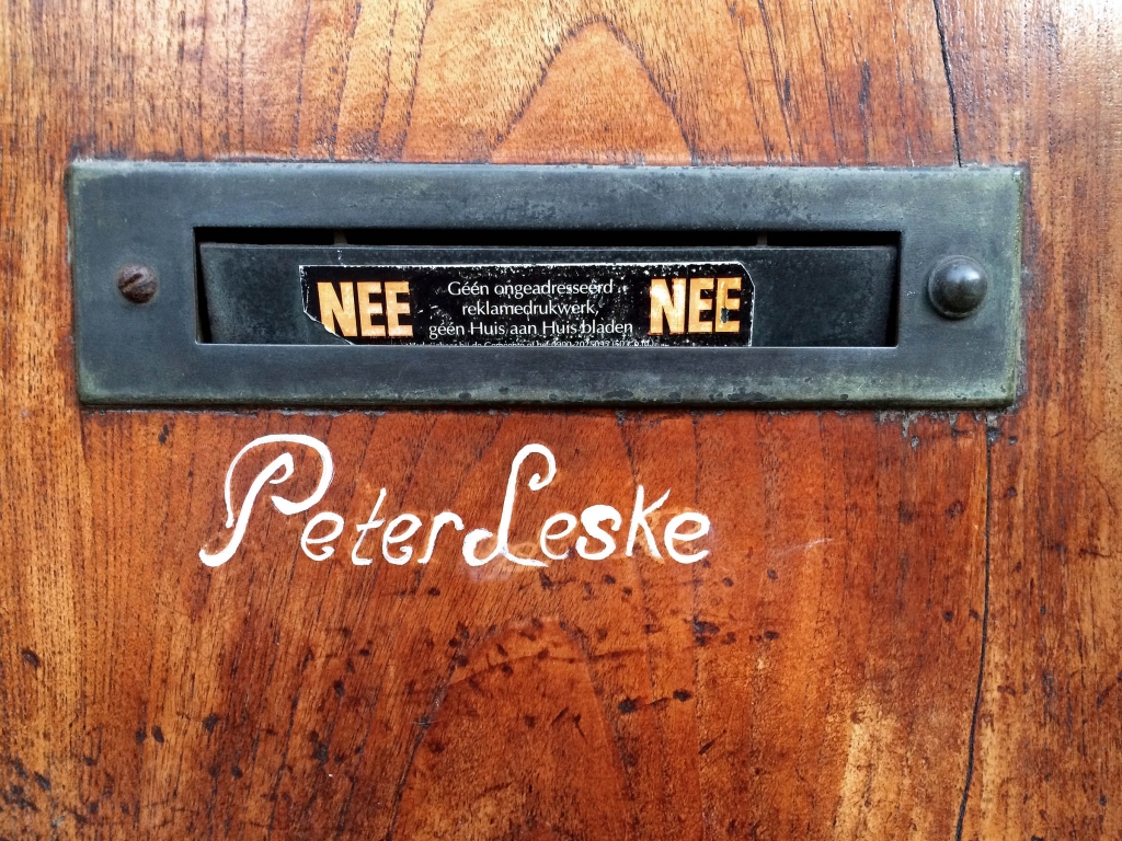
- Many Dutch put their name on the front door. I like the Didone style type for his name and how the enamel softens this typically sharp & clean style of type.
-
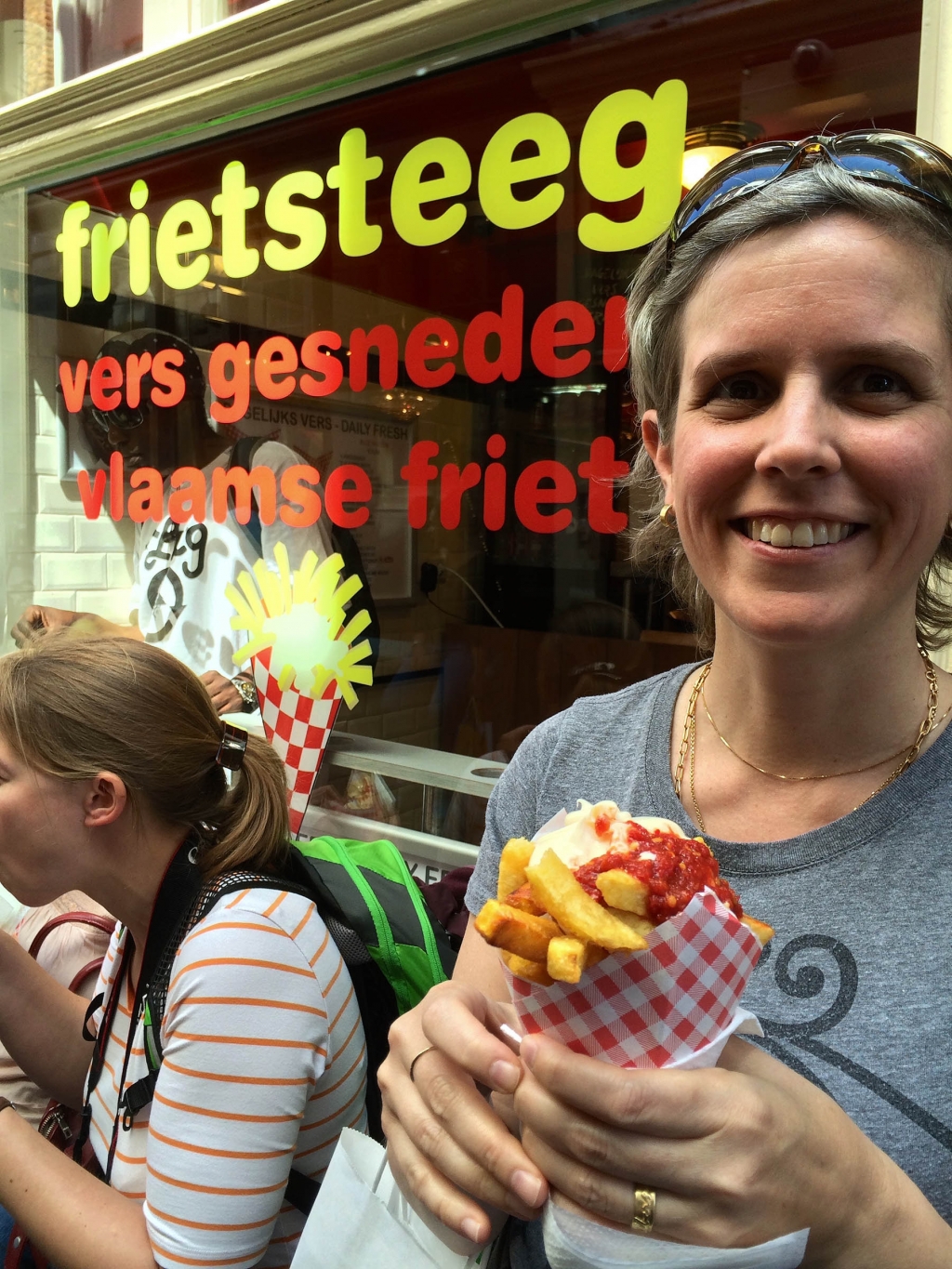
- Uber friendly font and classic fast food colors for a place that serves only one thing: fantastically delicious fries with add-ons such as mayo and sambal.
-
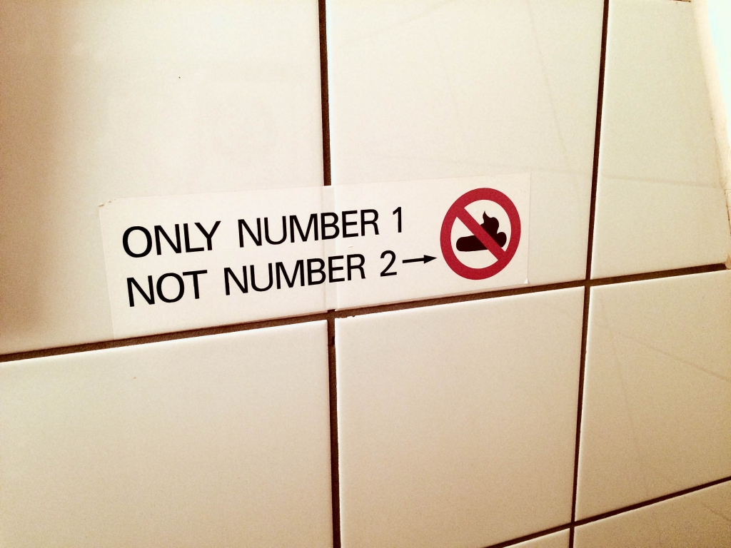
- Straightforward font for a straightforward message…perhaps Font Awesome should consider adding this icon to the set?
-

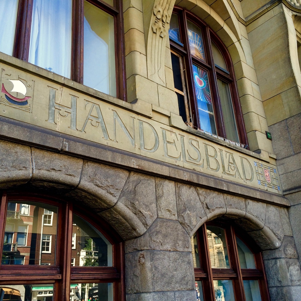
- Beautiful type; notice the refined accents and elegant serifs. Did you know the word serif comes from the Dutch word schreef, meaning line? This building is also a superb example of architectural rustication. My husband loves that contrast between smooth and rough stone.
-
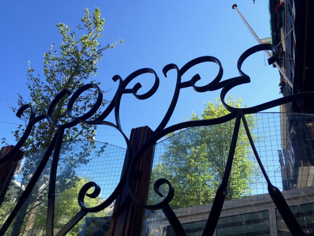
- The Cafe Hoppe courtyard fence has their name worked in iron.
-
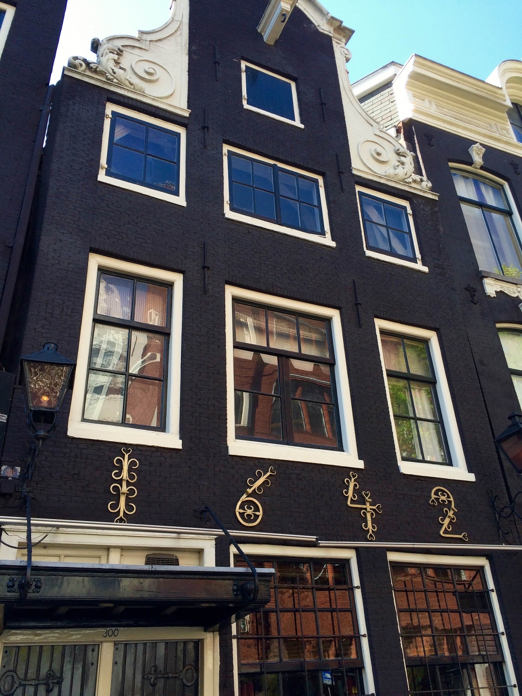
- I love the many styles and eras of type on this single building in the Jordaan.
-
- One of the many irresistible old buildings in the Jordaan with perhaps the cutest numbers ever.
-
- A sweet line drawing with a sweet message: love yourself. <3
-
- How the Dutch avoid junk mail (Nee! Nee!), and some charming hand painted script.
-
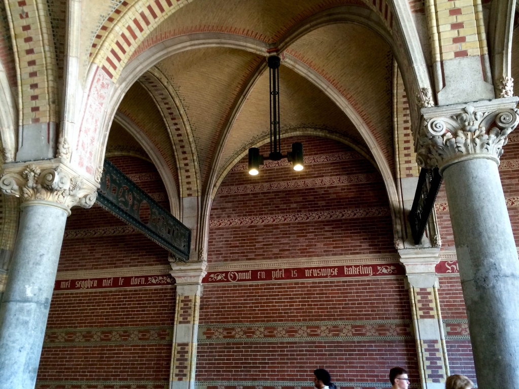
- Exquisite inset type at the Rijksmuseum; this is the passage where you can bike through the center of the museum structure.
-
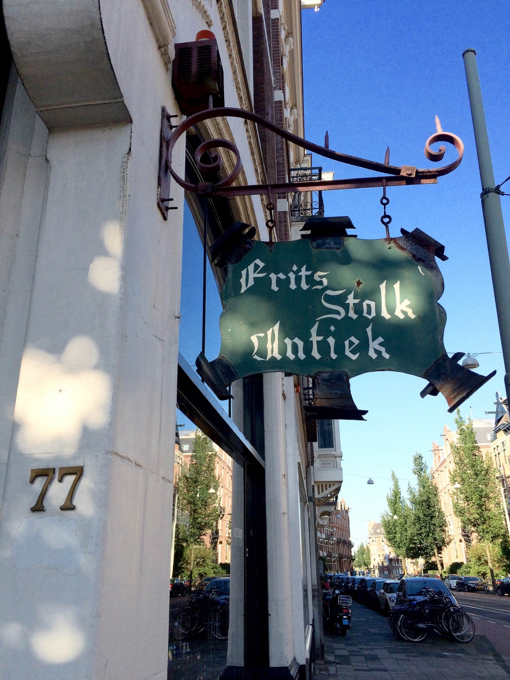
- More blackletter type with a very curious letter A; very cool sign shape too.
-
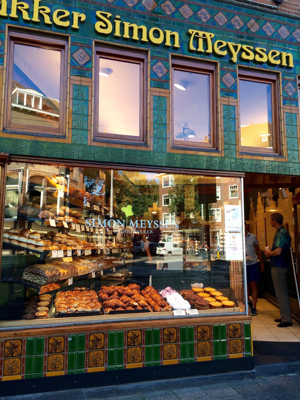
- Nice juxtaposition of Simon Meyssen’s old and new type. By the way, this baker’s bosbessen meringues rock (it’s a meringue with blueberries swirled in) .
-
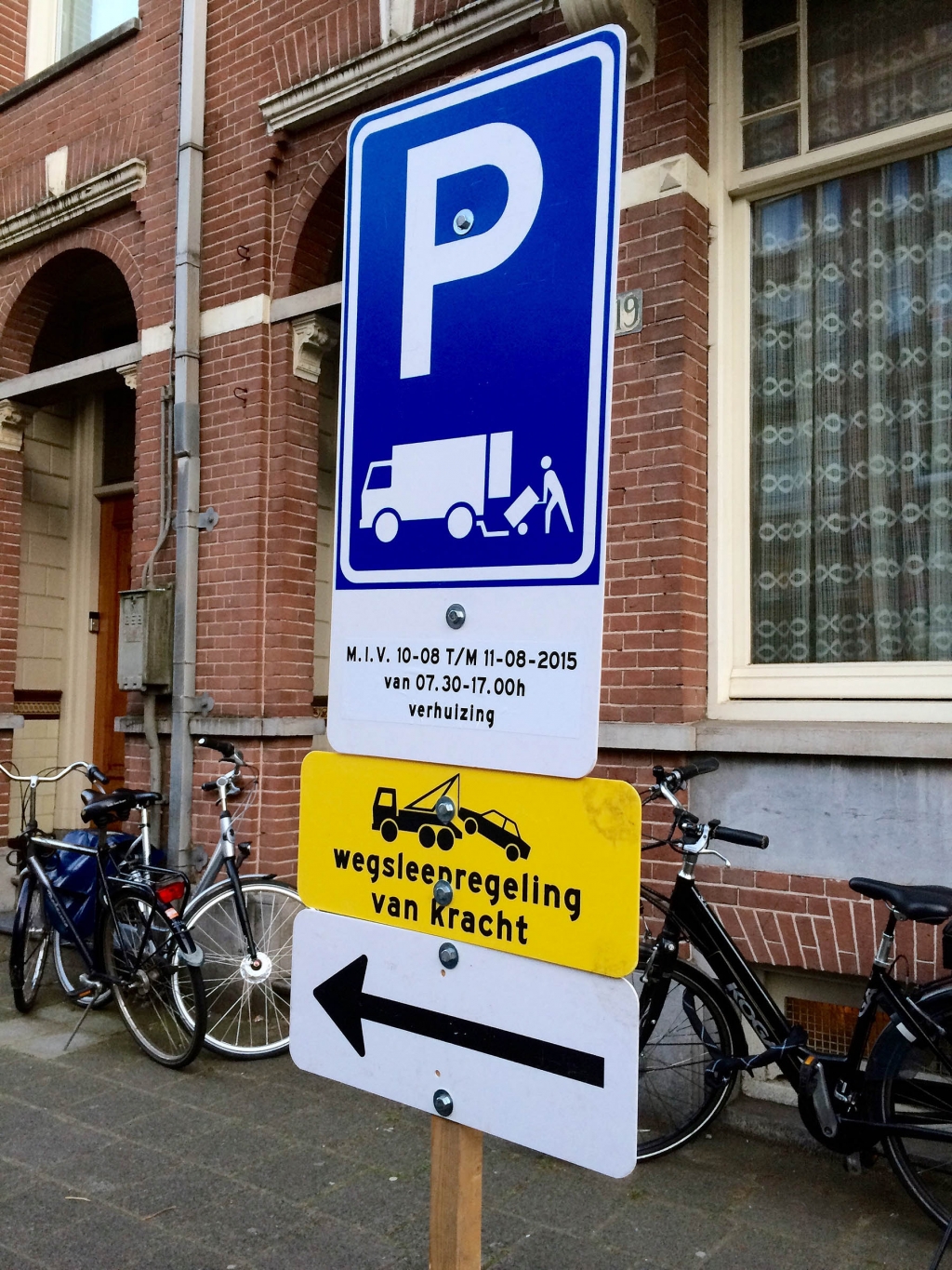
- Cute how they use all lowercase to say you’ll be towed away. I suppose it seems a little friendlier that way.
-
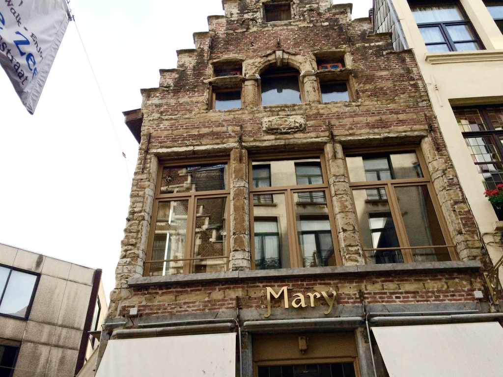
- This is technically not in the Netherlands, but close: Antwerp, Belgium. I like how the M dips down to match the y.
-
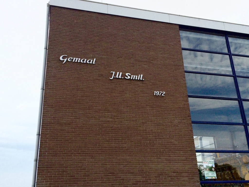
- Basic, but still thoughtfully executed.
-
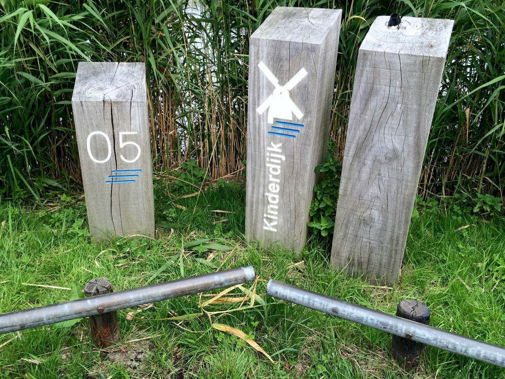
- Kinderdijk is a UNESCO world heritage site famous for its windmills that have been in use for hundreds of years. I like how they chose to include the zero in front of the single digit numbers on their location markers, presumably for design consistency (the markers went up into the double digits).
-
-
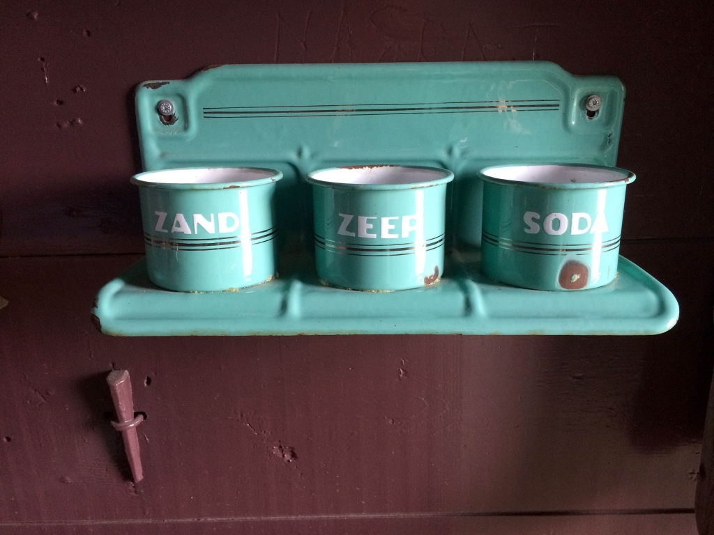
This was inside an historic windmill.
Zand Zeep Soda = Sand Soap Soda.
-
- Pretty numbers, eh?
-
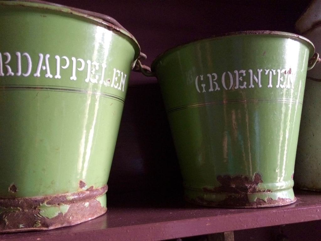
- The type on these fruit and vegetable buckets reminds me of dog bones—so cute.
-
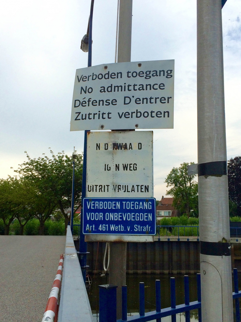
- At Kinderdijk, a totally unintelligible sign sandwiched between two clearly forbidding ones.
-
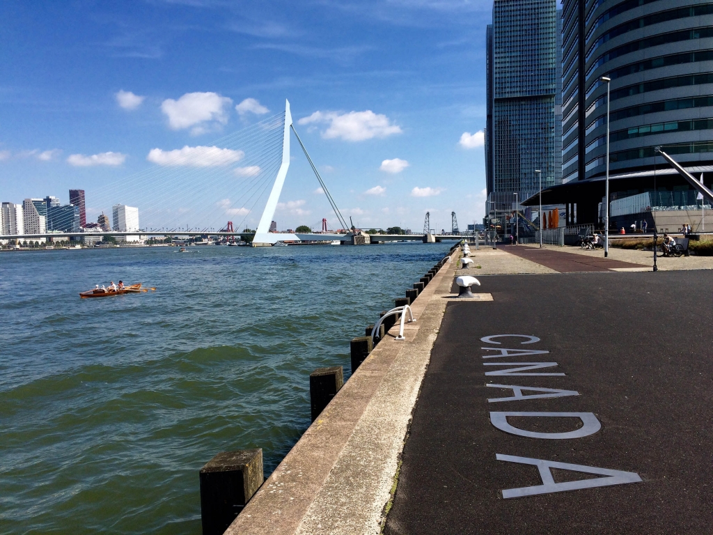
- Clean type inset into the pavement at the portside near the Erasmusbrug in Rotterdam.
-
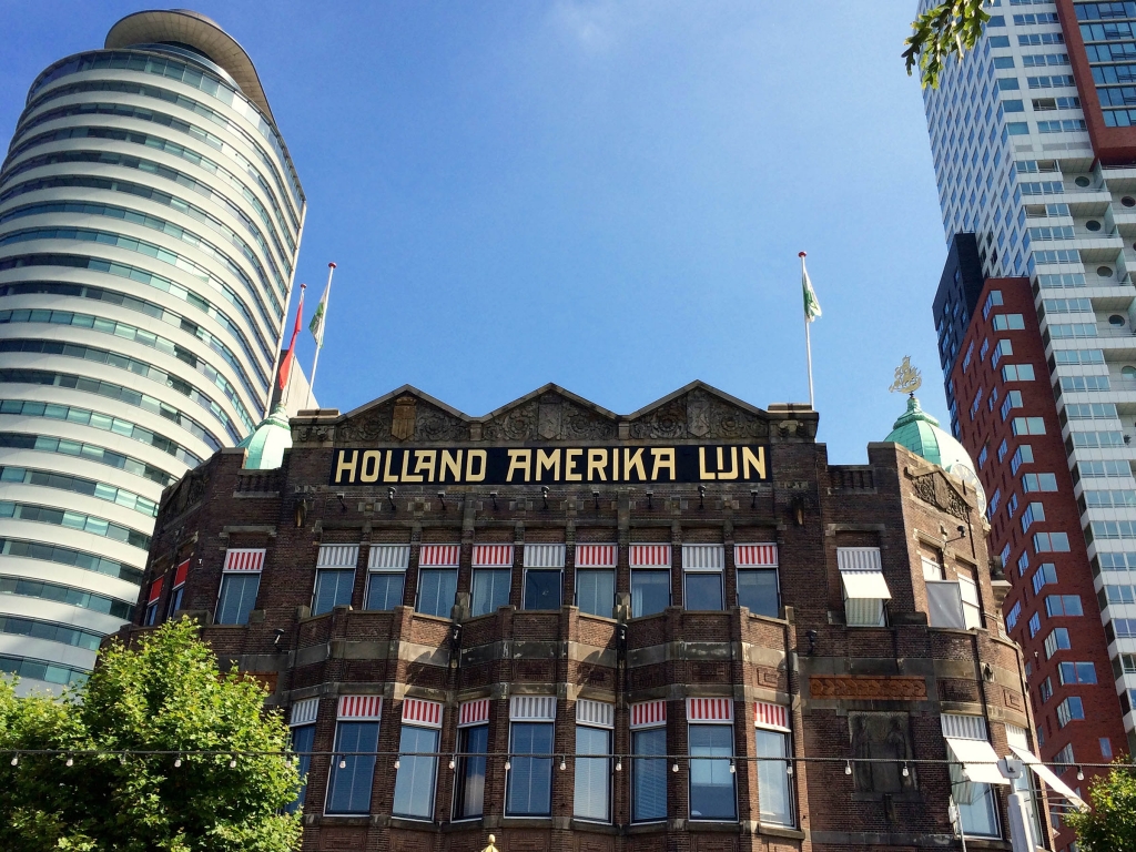
- Nice stepping up on the A in Hollan and the I in Lijn here. The Rijksmuseum uses the same treatment for their I/J combination.
-
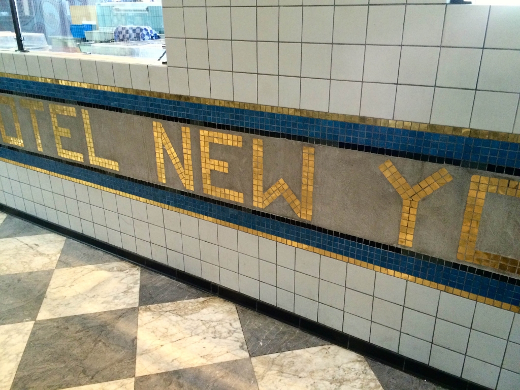
- Inside the Holland America Lijn building, snazzy use of metallic in mosaic.
-
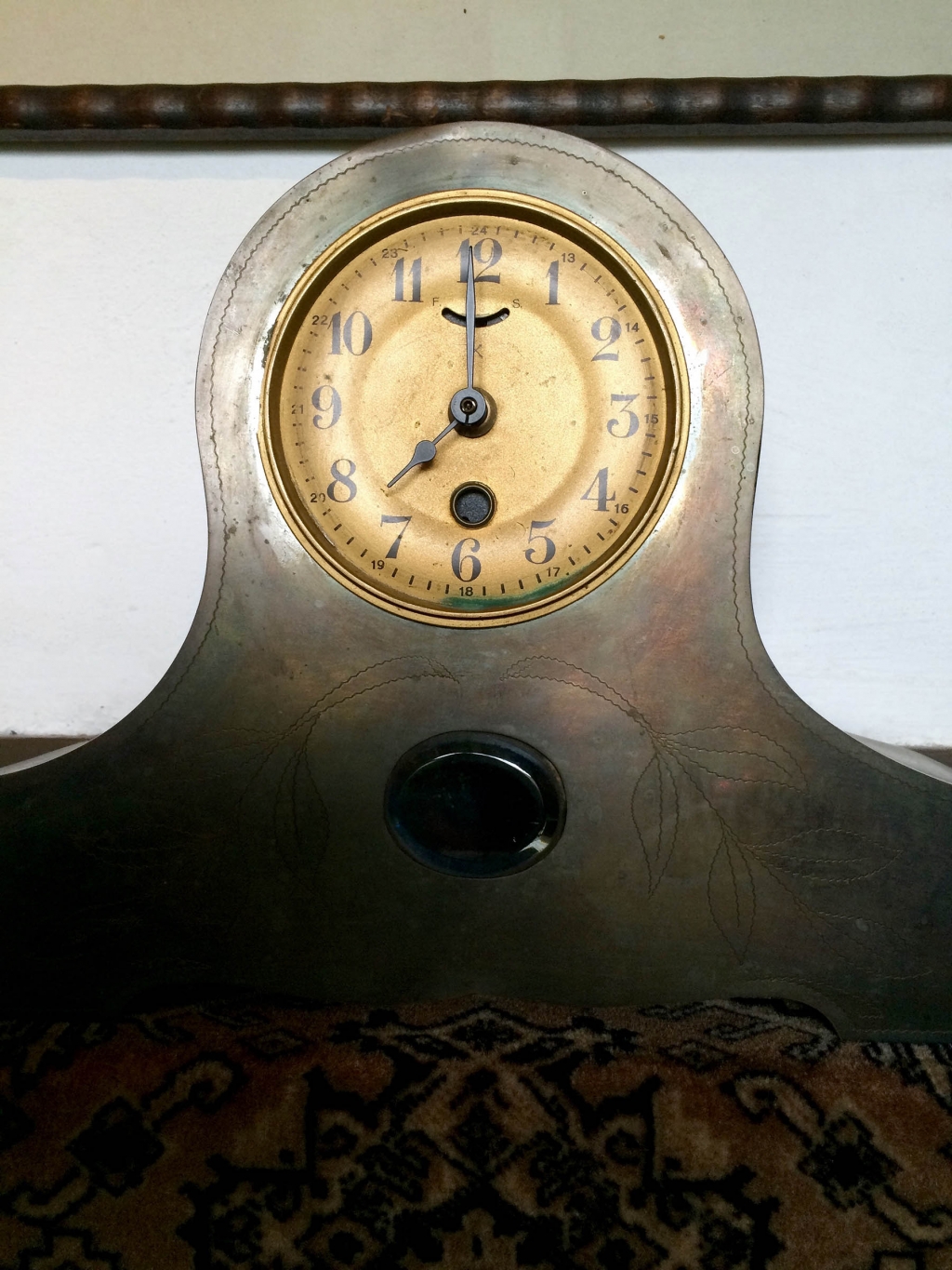
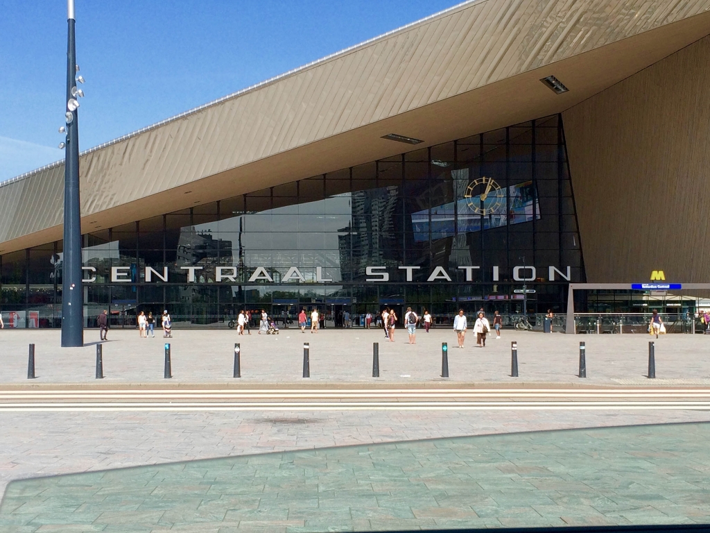
- Rotterdam’s new Centraal Station opened in 2014, but they brilliantly kept the original 1957 type and clock.
-
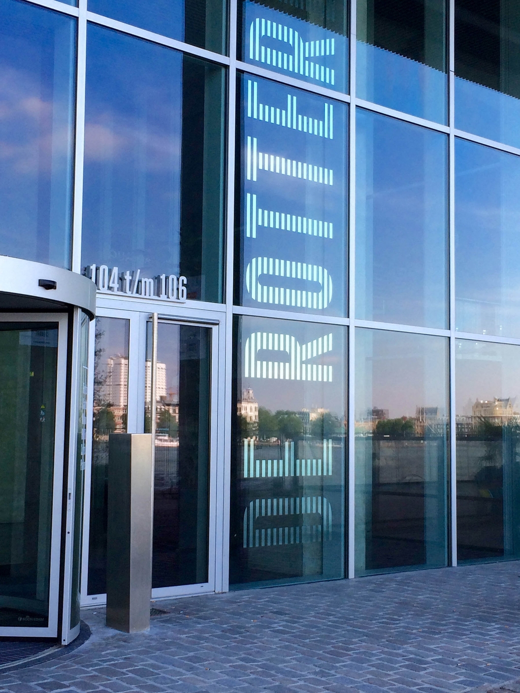
- I wonder if Rem Koolhaas chose this type…
-
- Or this.
-
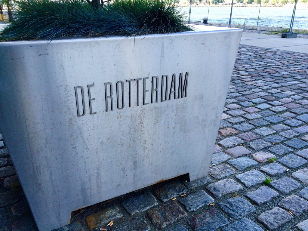
- More striped type at De Rotterdam. East tower, thatta way.
-
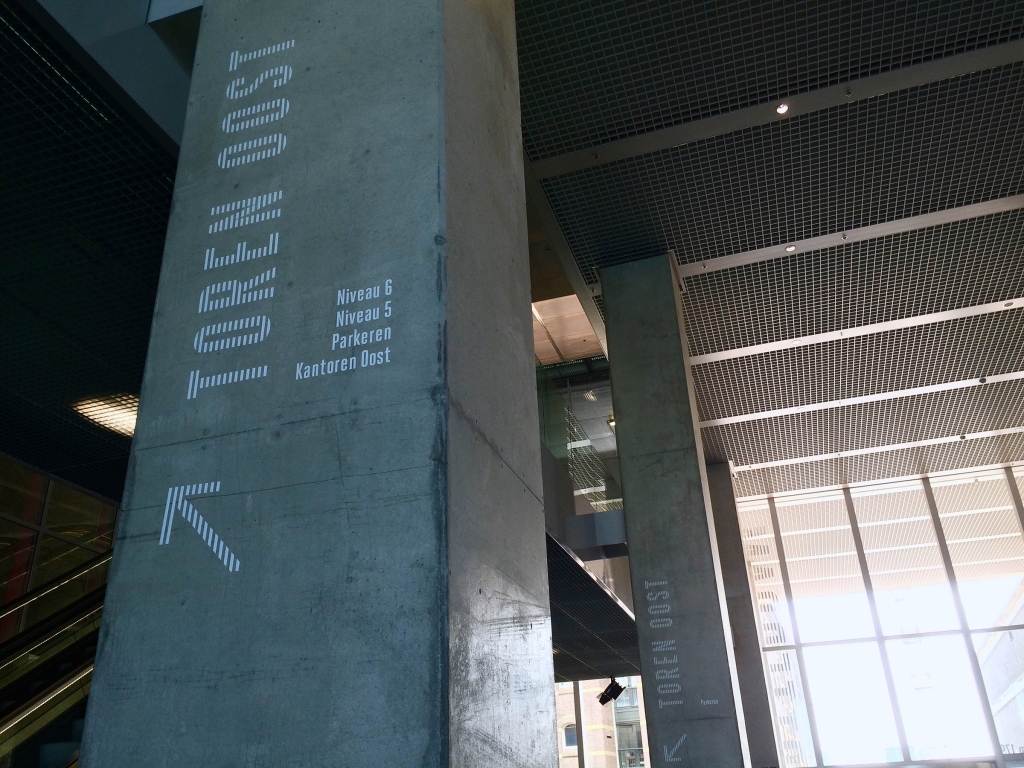
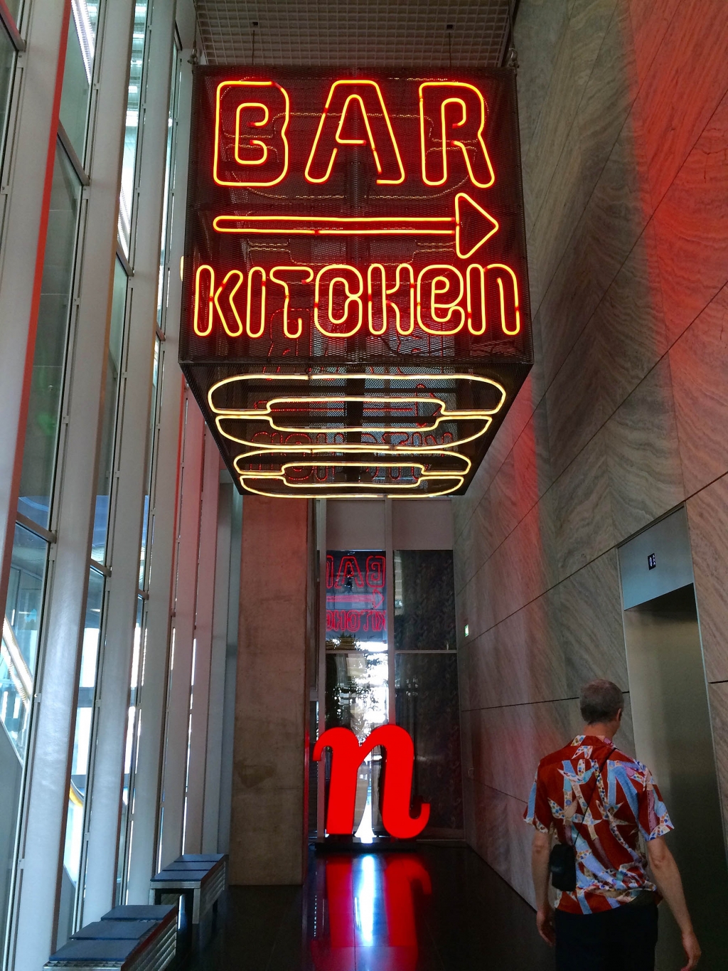
- A nice example of signage that works from many directions in De Rotterdam.
-
- The sign worked; we’re heading up.
-
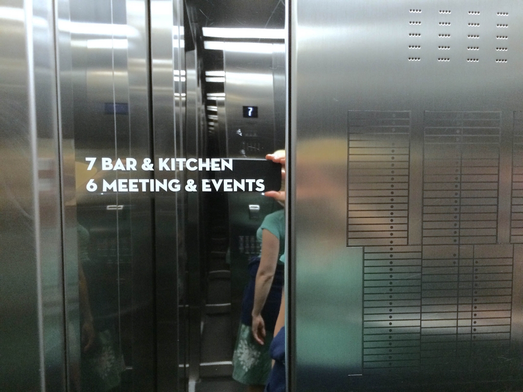
- Notice how the E in Events was modified to match the angle of the V…nice. The grid on the right is a simplified elevation of the building.
-
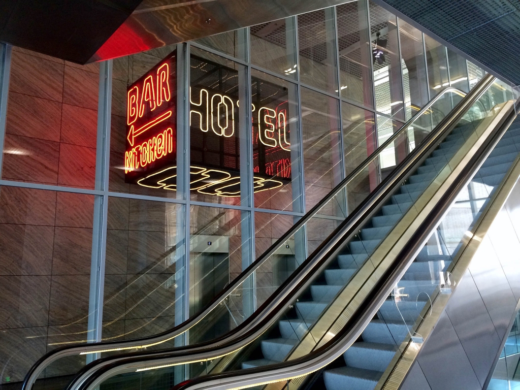
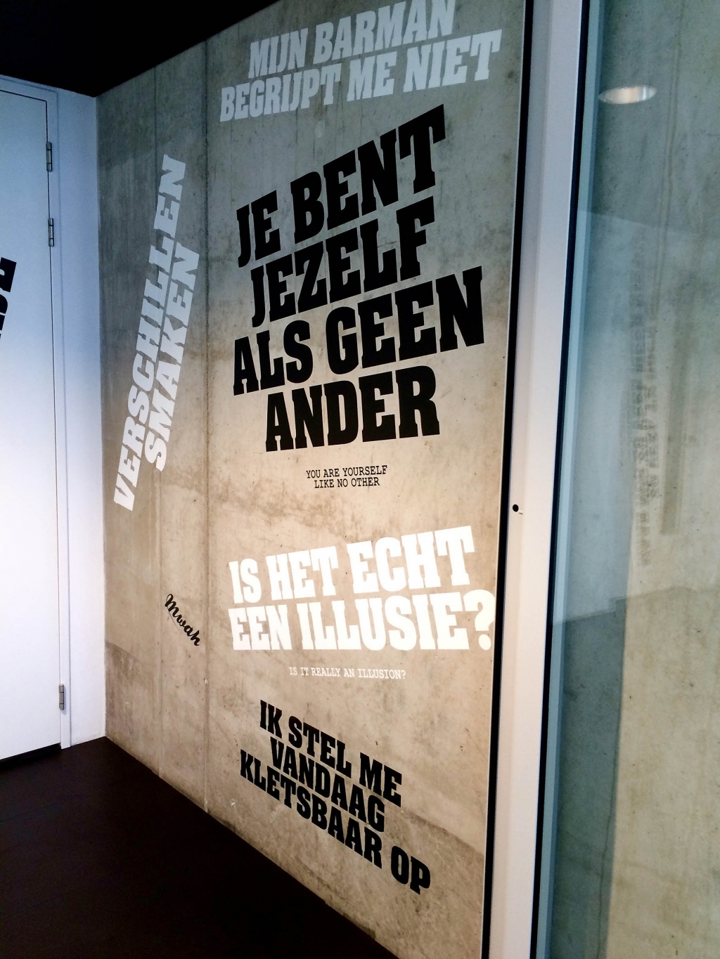
- This is in the restroom area of the restaurant nhow at De Rotterdam, which is decorated with wry messages including, “my bartender understands me not.” I like the little Mwah thrown in there.
-
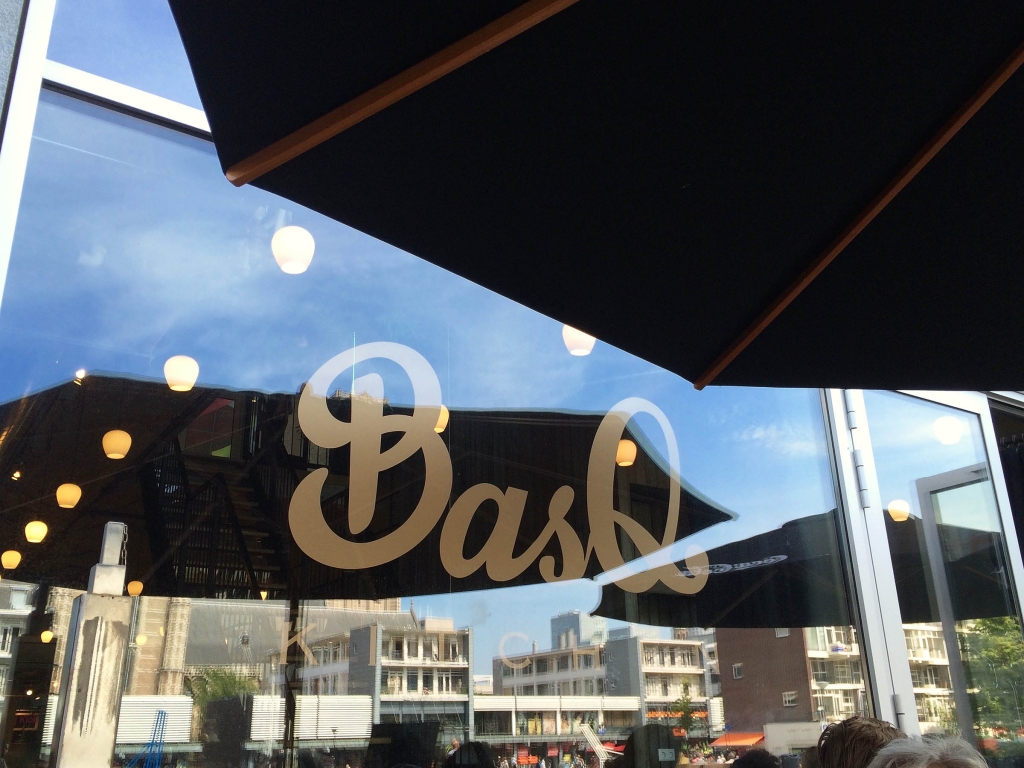
- A nice swashy script logo for BasQ, a tapas place in Rotterdam’s Markthal.
-
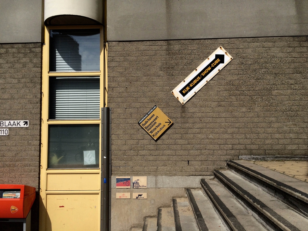
- If you want to know why these signs are like this, Google the Kubuswoningen.
-
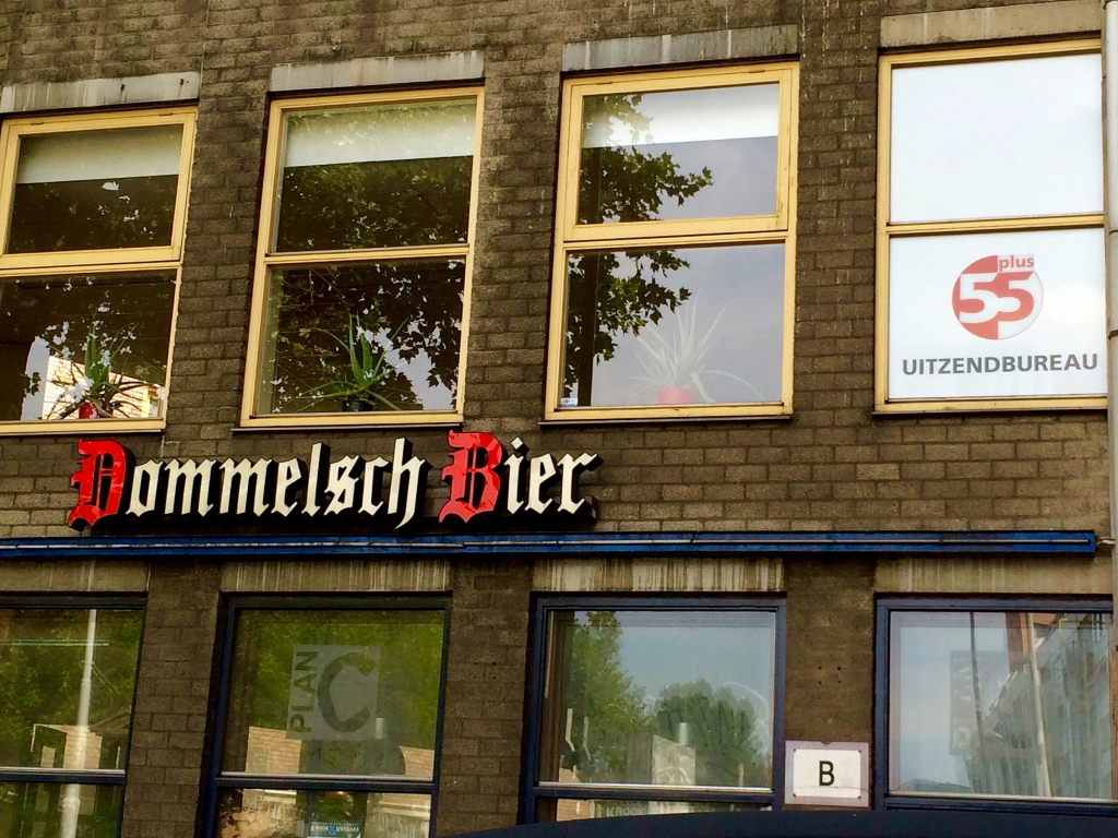
- Blackletter and sans serif often coexist in the Netherlands.
A few technical notes in closing: All of these photos were taken on my iPhone 5 (we like to travel light). Back at home, I light & color balanced the images in Apple’s Photos program to see what it could do vs. Photoshop CC. I was quite impressed with its abilities once I got down into all the detailed light and color adjustment options. It was easy to keep the colors in their correct and natural range, while adjusting each photo to feel as rich and lively as the scene looked in person.
“Ideally, travel broadens our perspectives personally, culturally, and politically. Suddenly, the palette with which we paint the story of our lives has more colors.”
—Rick Steves
Lastly, a big thanks to Dana & Hans, dear friends of ours who knew the must-see sites and brought us to many of them!
Would love to hear any comments and questions—or tell about your own favorite examples of typography in the Netherlands. I’d love even more excuses to go back. 🙂
Thanks for the ‘virtual” trip through your eyes!